IT TAKES TWO: A Collaboration with MJ Jackson of Conductor
We collaborated with MJ Jackson to create a collection that’s about candy, chaos, and shared desperation. Inspired by the moment on your ride when you’re teetering on hitting a wall (bonking big) and glimpse a convenience store glimmering in the distance. It becomes your highway savior and urgent destination. Your primal needs surface and you search for sugar in your favorite form. Rows, stacks, layers of bright, shiny packaged treats surround you and inevitably you fill up an entire plastic bag of which its contents you can’t recall. Welcome to the Roadside Diners Club.
Where did you find your original inspiration for the collaboration?
I started with a broad range of ideas, far too broad – I suppose that comes from the burden of an open brief, which is both exciting and sort of restrictive. Our client work with Conductor is all about telling our clients’ stories — living in their skin, uncovering their truths and finding inventive ways of conveying that. The brief here was more about my own relationship with cycling, so it was about telling my own story.
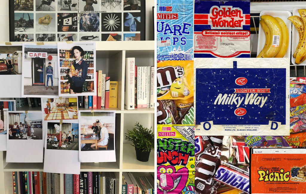 My side line project, Do It In Yellow, gives me the opportunity to create a cycling kit based on the things I love; jazz, puns, mid-century design. I didn’t want this collaboration to be an extension of that, I wanted to make something new and distinct and a more direct commentary on my relationship with cycling.
I started the way I often begin these kinds of projects; with written stories and themes. I created a number of headline emotions and descriptions which look like more film synopsis than creative briefs. Creating backstories around the themes helps me to define a coherence to the idea and play inside an idea that is more than just colour or pattern.
The design comes much later once I have a really solid idea of the story. The idea I settled on grew whilst I was riding, which made it seem all the more appropriate. I found myself eating a pile of crisps and chocolate bars, staring vacantly into the distance on some nondescript roadside, having completely bonked at the end of a ride. I’d had an idea about the Roadside Diners Club, embracing the lifestyle of eating terrible food from petrol stations and corner shops when you’ve run out of energy. We always see the glamorous side of cycling on instagram – elegant espressos and patisserie mid-ride in some beautiful piazza. The reality is we all end up at these vending machines and mini-markets, filling up on salty snacks and sugar to get us home.
How did that initial idea evolve? What did it turn into?
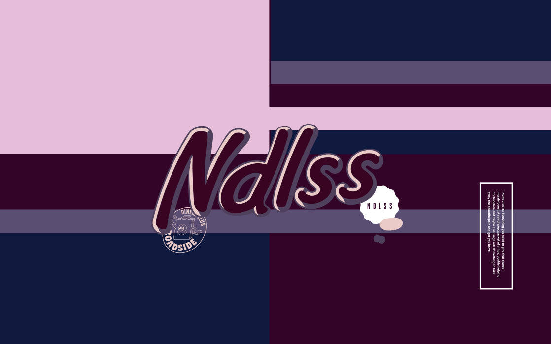
I got really taken with the assault on the senses as you enter these shops. Rows and rows of bright coloured packaging, often stacked pragmatically with labels obscuring labels and jarring hues nestled side by side. In your hunger stupor it can be all too much to take, so you just reach for everything.
I wanted to represent those blocks of colour and the semi-obscured brand names. I started with much brighter colours originally, but we pared them down to fit more into the NDLSS range and I think that worked really well. It takes the idea one more step away, which I love.
With that idea set, the real fun started — getting into the details of sweet wrappers and price stickers and those cheap plastic carrier bags they give you. All of those elements found their way into the final design.
 Were there any key images or ideas that drove your design? Did they stay present throughout the entire process?
I really wanted to render the NDLSS logo as a Mars logo. I think that element became more prevalent as the design progressed. I actually had this idea of a different route initially — I wanted to pay tribute to Diego Maradona who blew my mind in the 1986 World Cup. He played for Napoli who were sponsored by Mars and that kit always looked incredible. It was great that the idea worked for the Roadside Diners Club too.
The key element that pervaded was the overlaying colour blocks. I have some reference images that really stayed with me. Blocks of colour simplified down with slices of logos and typography half hidden.
How does this collaboration represent you as a cycling/artist?
I like how the concept captures a universal truth amongst cyclists, whatever their ability and however they ride. That idea that we’ll all end up hungry or thirsty, looking for any shop. As a designer and a cyclist I like the concept of elevating the ordinary — celebrating the small things. I hope I’ve managed to keep the idea uncomplicated, I always aim for the simplest rendition of any idea. Many years ago I used to make music and the aim was always for songs under three minutes. The challenge was always to get the story across in that time. You have to have a very good reason to make people listen for more than three minutes, I apply that thought to design. I am happy for people to work hard to get the idea, but not so hard that it’s too much effort.
Which parts of the collaboration are yours and which are NDLSS?
The colour palette is definitely NDLSS influenced! I love the colours and I’m incredibly proud of the final result, so I’m glad we worked together to get to that end result. I think we share a spirit and an attitude, it’s probably what brought us together in the first place. So I think the character that runs through the collaboration is unified between us. I don’t know that I could have arrived as the same solution for another cycling brand.


